Trainline x Google

Helping users to their destination

Brief

To create ways to reassure passengers coming to Trainline from Google, communicating the positive propositions of the product.

Client

Trainline

Project Date

2024

Role

Senior UX/UI Designer (contractor)

Google Trains

Google has introduced a Google train module, which allows users to search for their journeys on google rather than using the trainline service. Whilst good for the user the integration with the trainline allows users to go directly to the train search result without seeing any of the user benefits of using the Trainline platform.

Approaching the problem

With a view to get this feature live as fast as possible we had a 5 day turn around to go from a concept to a design that was ready for development. I took the initiative to bring some elements of existing designs and concepts already in the design system to bring this to life. With one eye on the developer resource needed for this project it was all about quick wins and a scalable concept we could iterate on top of!
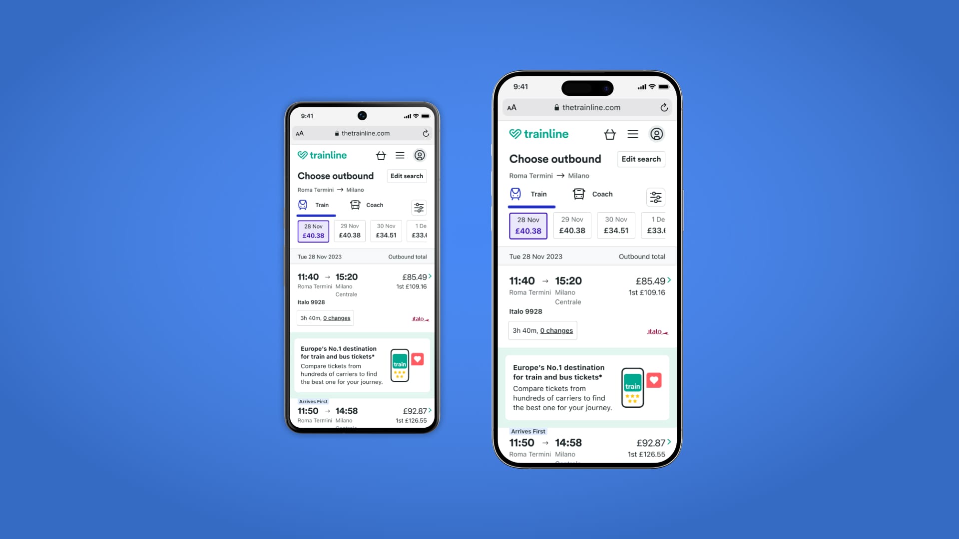
Main image showing trainline concept design

Introduction to Google Users

Targeting the users

With this project needing an urgent turnaround, the first aspect was to be able to reuse some design system principles but to adjust them for the users coming from the Google Trains platform. Especially targeting the EU and USA customer markets. This, for me, meant that we should value the journey the user has made to come to the trainline above everything else.

These users had come to the Trainline product from an external third party Google search module , and as such the goal was to try and sell the product features but with the key incentive was to not disrupt the user's main goal. A positive first exposure were essential especially in markets where the Trainline brand didn't have that big brand recognition.

 trainline website conceptual designs

First iteration

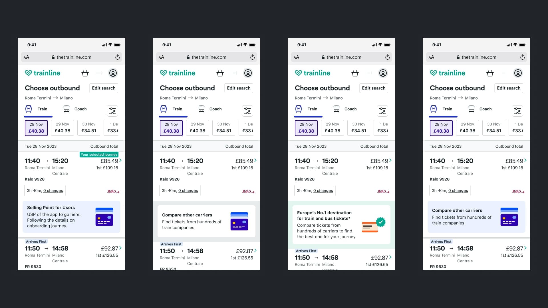
Adding the logic of what the user had been doing before they landed on this page, we knew that the user had to have clicked on a journey on the Google module to get to this screen. So I first brought this selected train journey to the very top of the page, ensuring it was clear and obvious that their journey was still right there for them to purchase.

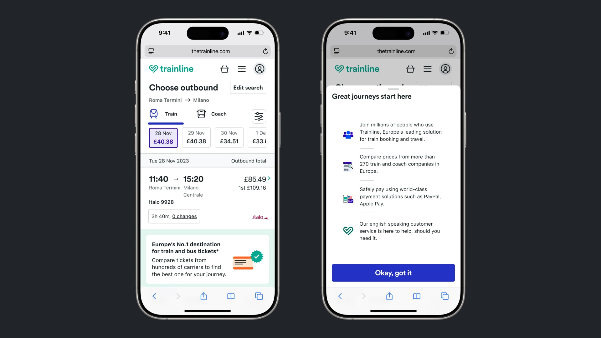
Underneath the selected journey I have added the biggest change for users from the google platform. By adding a reassurance message in an easy-to-access position which promotes the product and ensures the user of the benefits of using the Trainline platform.

This clickable element will open a new modal which will be able to sell personalised benefits of the platform based on common highly rated features with positive feedback.

Mogs Christmas in a TV showing the rewind feature

Design Details

I went through many different iterations of the design here as shown above before coming together with the design team to get the final design signed off. These designs were taken through usability testing to ensure they hit our product targets using an eternal resource alongside the Trainline internal research team.

As this design was aimed at multiple markets, I also worked closely with a UX copywriting team to get each locale’s final copy as well as a localisation team for any translations needed before the design and copy was signed off by legal and marketing and then finally released to the public.

Results and next steps

This module had an instant effect on the conversion of users. We saw a drop in users clicking through from Google and then leaving the platform.

We also unexpectedly saw an increase of users who came from google returning directly to the Trainline platform.

As this was the first short term iteration for this product, as soon as the public saw this version I was working on the second iteration with a much stronger emphasis on the Trainline brand, starting to incorporate more rich media into the product through animations and motion design.