Brief
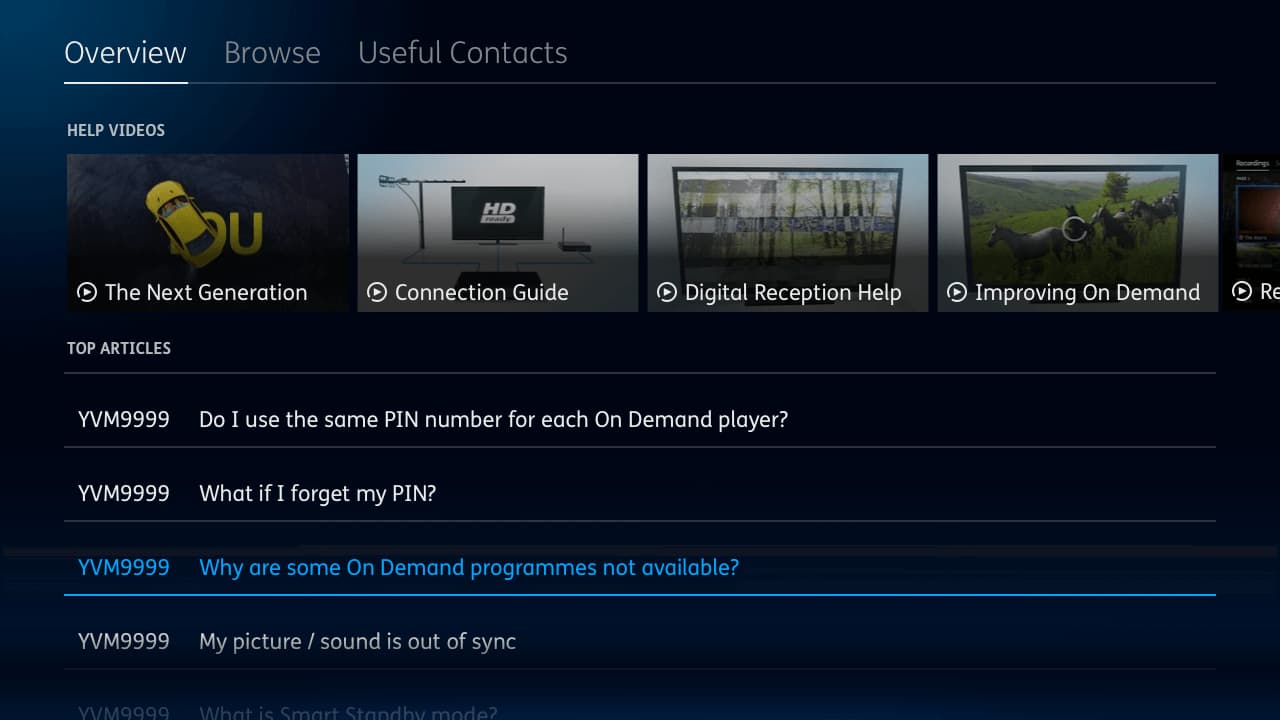
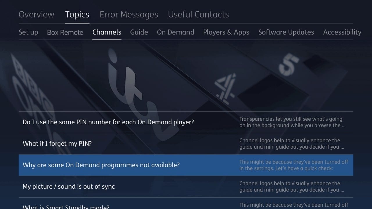
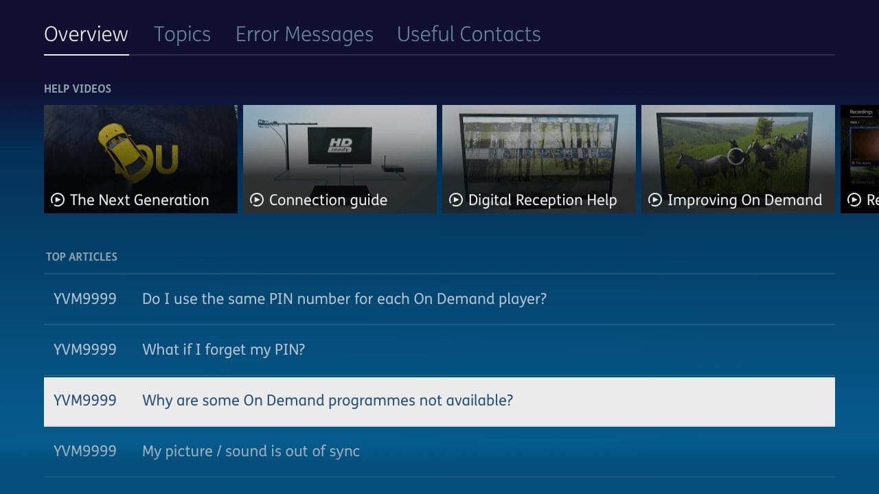
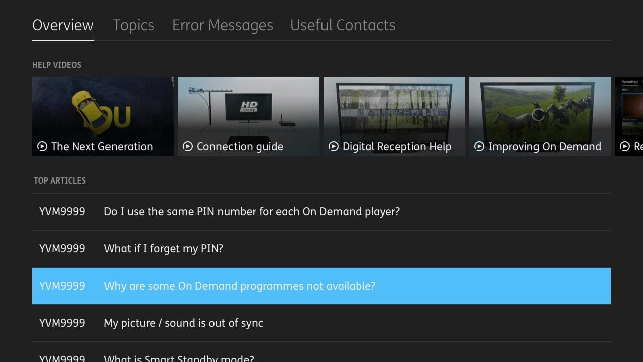
Update the Help app on YouView platform to bring it more in-line with the Next Generation user
experience. Ensure that the design correspond with the YouView, BT and TalkTalk support sites
whilst
retaining the ability for users to troubleshoot
their problems.
Customers who currently use the service but may have difficulty using the
product due to sight-related issues. Customers who wish to have a more accessible TV
service
The legacy YouView help menu was built
as a way for customers to solve the problems they were facing in their own time. The
depreciation of
the legacy UI and the move to the Next Generation interface pushed forward the need to bring the
Help App into line with the revamped
service.
I was chosen to lead this project working alongside a junior designer and an intern,
helping to guide them towards a final product
Client
YouView TV Ltd
Project Date
2018-2019
Role
Lead Product Designer
Problems & Goals
The release of the next generation YouView UI had left the help app feeling out of date and
disconnected from the main user experience.
The help app, designed alongside the initial launch in 2012, was clunky, slow and
was
designed in a way which was no longer applicable for our needs.
Its usability was challenged and our data showed that we were having more calls and
social media posts with problems that could be solved with an improvement in the help app
Goals
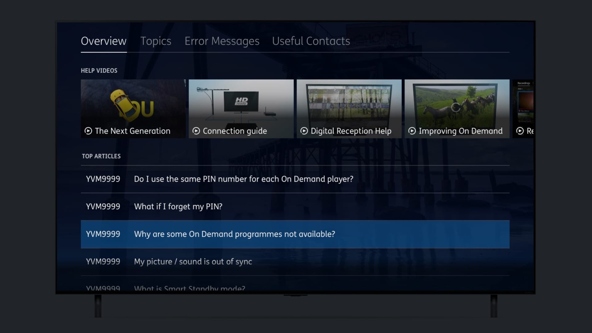
The goal of the help app was to create an convenient way to solve issues a user would have. We didn't want to just reskin the existing help app, we wanted to create a great experience that would help a user in a stressful time.
Create a consistent user journey matching the rest of the UI
Use a scalable template based system for iterative design
Lower the amount of calls and support-site hits
Role & responsibilities
I was placed into the project as the lead designer and worked collaboratively with both a
junior
UX designer and an intern from the visual design team, allowing them to progress designs and
involving them in every stage of the process.
In addition, other designers were involved and contributed to ensure a collaborative working
environment.
I stopped working on this project after stakeholder buy in, as the
project was
entered into our agile backlog
Project kickoff
Workshops and insights
At the beginning of the project the whole agile cluster was brought together to kick
off.
By bringing all the team, developers, testers amongst others, gave everyone an
opportunity to brainstorm the issue’s and to create a sense of ownership of the project
for
all.
We also brought in the information gathered by our viewer support team, as well
as
insights gained from the use of social media to help guide the conversation and to stay
on
topic.
This initial kickoff opened the conversation in the team and before long it
became
a
team based user testing session. People were starting to find issues that we hadn't even
seen
reported by actual users, but which would
make our product even better.
“I can't find the right article"
“I have to open each article to see if its the right one?"
"Why can't it just show me how to fix this?"
Existing customer feedback
Reevaluating the issues
All this work looking into the issues led to the team
thinking
on
the initial brief.
Our insights told us that maybe the brief was wrong, it wasn't just the
customers
journey was difficult, but they were also not finding the relevant content and that led
to
frustration and in turn led to the customer phoning
or using social media to air their frustrations.
We then had to ask the question, how can we present not just the best content,
but
the
right content for the customer.
Redesiging
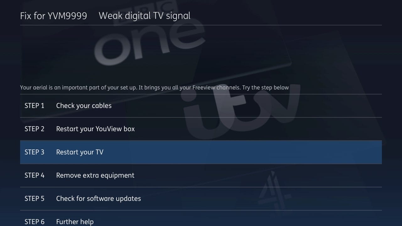
A customer doesn't always need to know exactly what's wrong. Sometimes they just want it
fixed.
We didn't want the user to have to jump through hoops to find solutions and we wanted to
make it
quick and easy for them to get back to
watching their favourite content.
Having the right information
A customer doesn't always need to know exactly what's wrong. Sometimes they just want it
fixed.
We didn't want the user to have to jump through hoops to find solutions and we wanted to
make it
quick and easy for them to get back to watching their favourite
content.
With our initial whiteboard sessions, we came up with some major goals we wanted for the help app.


